
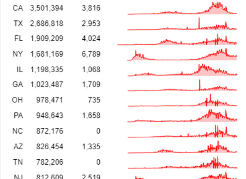
I recently came across a Stackoverflow question, on the possibility of creating sparklines within vega-lite.
The question pointed to a visual that show the number of Covid Cases by State. Having played around a lot with Deneb and PowerBI I thought this should actually be possible with not a lot of code.
I had a lot of issues doing this in Power BI with Deneb, as Power BI kept crashing due to Webview2 issues. I think the amount of datapoints was an issue, even with the limit of 10,000 records.
Dataset
The dataset can be downloaded at the following link.
Fields used
- date
- state
- positiveIncreases
- positive
Specification
The specification in a nutshell:
facet
  * row
spec
  * layer
    * text mark
    * text mark
    * area mark
1
2
3
4
5
6
7
8
9
10
11
12
13
14
15
16
17
18
19
20
21
22
23
24
25
26
27
28
29
30
31
32
33
34
35
36
37
38
39
40
41
42
43
44
45
46
47
48
49
50
51
52
53
54
55
56
57
58
59
60
61
62
63
64
65
66
67
68
69
70
71
72
73
74
75
76
77
78
79
80
81
82
83
84
85
86
87
88
89
90
91
92
93
94
95
96
97
98
{
  "$schema": "https://vega.github.io/schema/vega-lite/v5.json",
  "data": {
    "url": "https://api.covidtracking.com/v1/states/daily.csv",
    "name": "dataset",
    "format": {"type": "csv"}
  },
  "facet": {
    "row": {
      "field": "state",
      "sort": {
        "field": "positiveIncrease",
        "op": "average",
        "order": "descending"
      }
    }
  },
  "spec": {
    "transform": [
    {
      "calculate": "datetime(slice(datum.date,0,4), slice(datum.date,4,6),[slice(datum.date,6,8)])",
      "as": "__date"
    }
  ],
    "height": 20,
    "layer": [
      {
        "mark": {
          "type": "area"
        },
        "encoding": {
          "x": {
            "field": "__date",
            "type": "temporal",
            "timeUnit": "yearmonthdate",
            "axis": {
              "title": null,
              "orient": "top",
              "domain": false,
              "ticks": false,
              "labels": false,
              "grid": false
            }
          },
          "y": {
            "field": "positiveIncrease",
            "aggregate": "sum",
            "type": "quantitative",
            "axis": {
              "title": null,
              "domain": false,
              "labels": false,
              "ticks": false,
              "grid": false
            }
          }
        }
      },
      {
        "mark": {
          "type": "text",
          "align": "right",
          "dx": -120
        },
        "encoding": {
          "text": {
            "aggregate": {
              "argmax": "__date"
            },
            "field": "positiveIncrease",
            "format": ",.0f",
            "type": "quantitative"
          }
        }
      },
      {
        "mark": {
          "type": "text",
          "align": "right",
          "dx": -180
        },
        "encoding": {
          "text": {
            "aggregate": {
              "argmax": "__date"
            },
            "field": "positive",
            "format": ",.0f",
            "type": "quantitative"
          }
        }
      }
    ]
  },
  "resolve": {
    "scale": {"y": "independent"}
  }
}
Config
1
2
3
4
5
6
7
8
9
10
11
12
13
14
15
16
17
18
19
20
21
22
  "view": {"stroke": "transparent"},
  "header": {
    "title": null,
    "labelAngle": 0,
    "labelAlign": "left",
    "labelFontSize": 12,
    "labelFont": "Arial"
  },
  "text": {
    "font": "Arial",
    "fontSize": 12
  },
  "facet": {"spacing": 1},
  "area":{
      "interpolate": "monotone",
          "line": {
            "color": "red",
            "strokeWidth": 1,
            "interpolate": "monotone"
          },
          "fill": "#faa"
  }